If you've searched "how to mix metals and wood" in the last year, the advice you got was almost certainly about colour temperature: warm with warm, cool with cool, brass with walnut, chrome with ash, find a bridge tone. It's the default frame in every interiors blog, and it isn't wrong. It's just the smallest part of the actual problem.
We've furnished our own home in Bhilwara, watched the same rooms turn over twice as we changed our minds, and helped a steady stream of customers think through the same question. The pattern is consistent: the rooms that fail almost never fail on colour. They fail on something most articles don't name.
The real fight isn't temperature — it's visual frequency
By visual frequency we mean how busy the surface of a material reads at the scale you actually see it from across the room. A mango-wood plank with a dramatic, swirling grain is high-frequency: your eye keeps moving across it. A powder-coated black metal stool is low-frequency: your eye lands and rests. Put a loud-grained wood next to a flat-finished metal in a small room and the wood feels louder than it should; the metal feels emptier than it should. It isn't a clash. It's a tempo mismatch, and the room can't settle.
Once you start seeing this, you can't unsee it. A brass utensil shelf above terrazzo flooring works because both surfaces are dense and patterned — the frequencies match. A polished jharokha-style mirror works against a flat lime-washed wall because the frequencies are deliberately opposed and the wall gives the eye somewhere to rest. A walnut side table with a tight, even grain sits comfortably with a brushed-gold lamp because both occupy a similar middle frequency. None of these pairings share a colour family. They share, or knowingly oppose, a level of busyness.
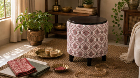
Our working rule: before you think about whether the brass is warm enough for the walnut, ask whether the wood you're using is shouting or speaking. Most pooja-corner failures we see are three high-frequency pieces stacked together — a busy-grained shelf, a hammered diya stand, a hand-beaten kalash — with nowhere for the eye to land. Swap the calmest piece for something even calmer, and the corner reads as devotional instead of cluttered. The piece that's wrong is almost never the one that looks wrong.
Treat metal as a condiment, not an ingredient
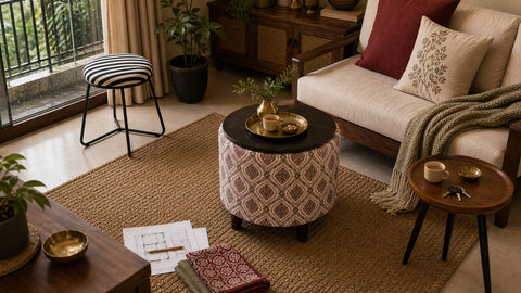
Indian homes are wood-heavy by default. Doors, frames, pooja units, the inherited almirah, the chowki nobody uses anymore but no one will throw out. The ambient wood-to-metal ratio in most flats we see is heavily skewed toward wood. Introduce a metal stool, a brass lamp, or a steel-framed coffee table and the ratio barely moves — yet the room suddenly feels considered.
That's the leverage metal offers in an Indian context, and it's also the reason it's so easy to overdo. Too little metal and it reads as accidental, like a leftover from someone else's place. Too much and the room starts to feel like a showroom or a hotel lobby, which is the failure mode no one in a warm Indian home wants. The sweet spot is narrow: enough that a guest notices the piece, not so much that it announces itself.
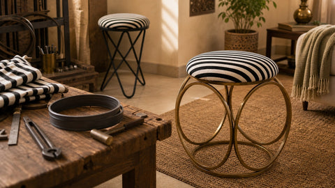
This is also why we build the Cage stool as a set of two rather than singly. In a wood-dominant Indian room, a single golden stool reads as an afterthought; a pair reads as an intention. The pair is the smallest unit of metal that can hold its own against a heavy wooden sofa or a teak chowki without disappearing into the background. If you're adding metal to a room that has none, our standing advice is: add two, not one.
Sheen is the axis nobody talks about
Colour temperature: discussed to death. Frequency: rarely discussed. Sheen: almost never. Yet sheen is what separates a room that looks resolved from one that looks restless.
Sheen is simply how much light a surface throws back. A high-gloss polished brass throws back nearly all of it. A matte powder-coated finish throws back almost none. A waxed mango-wood surface sits in between — a low, soft return that flatters most lighting. A cotton lampshade in handwoven Bhilwara fabric kills the light entirely, which is part of why a good lampshade is one of the strongest mediators in any metal-and-wood room.
Our working rule, refined across several rooms we've furnished: in any space that mixes metals and wood, try to keep no more than one high-gloss surface in a single eyeline. If you have a polished brass mirror, the stool below it should be matte. If your accent stool is a glossy gold, the table beside it should be oiled and quiet, not lacquered. Two glossy surfaces fighting for the same line of sight is the most common reason a room with otherwise good pieces reads as expensive but uncomfortable — your eye keeps darting between the highlights and never settles.
This is why we lean toward muted finishes on our metal pieces, and why our walnut and metal side table pair uses a brushed frame rather than a mirror-polished one. The brushed surface holds light gently; a polished one would throw it back into the rest of the room and force every other piece to compete.
Bridge with textile, not with a third material
The standard fix when metal and wood aren't talking is to add a third material — leather, stone, ceramic, glass — to mediate between them. All of these can work. The one that works most reliably in an Indian home, in our experience, is textile, and specifically the textile vocabulary already native to most Indian rooms: handwoven cotton, mulmul, hand-block print, kota doria, the bandhani throw from the back of the cupboard.
Textile bridges because it does three things at once. It softens the sheen mismatch — fabric throws back almost no light, which calms a room dominated by competing reflections. It mediates the frequency mismatch — a hand-block print sits at a middle frequency between flat metal and busy grain, giving the eye a transitional step. And it carries the warmth that an Indian summer rewards: leather feels hot, stone feels cold, but a cotton cushion or a block-printed runner stays comfortable through both monsoon humidity and dry-season afternoons.
If you're styling a room and a metal-and-wood pairing isn't landing, our first instinct is no longer to swap a piece. It's to add a runner, a cushion, a small framed textile on the wall. The bridge is almost always cheaper than the replacement, and it usually solves the problem the replacement would only have masked.
The jharokha lesson — and where to start
The old jharokha — the carved wooden window-frame you'll see in havelis across Rajasthan — is itself a metal-and-wood object, even when it appears to be only wood. Look closely and there's almost always a brass or iron hinge, a hand-forged nail, a metal latch at the joint. The carved wood is high-frequency. The metal is low-frequency. The brass is glossy. The wood is matte. By every rule we've laid out, it should be a mess. It's the opposite — it's one of the most resolved objects in Indian domestic design.
The reason, we think, is that the jharokha was made by one person, or one workshop, over weeks. The metal wasn't added later. It was integrated from the first sketch. Every Indian home that successfully mixes metals and wood is, in some small way, recreating that logic — choosing pieces that feel like they came from the same head, even when they didn't. We wrote more about that head-and-hand integration in our piece on Indian metalwork from workshop to home, which is the companion essay to this one.
If you're starting from a wood-heavy room with no metal in it yet, the lowest-regret first move is to anchor with a single piece that already contains both materials in resolved proportions — a small walnut-and-metal side table, for instance, sets the room's frequency, sheen, and ratio in a single object. Build outward from that, adding the pair of stools next, then a textile bridge, then a single metal accent on the wall. You can lift the same approach for tight urban floor plans — we walked through it for a Mumbai context in our space-saving piece.
Strip everything above down to four moves and it's this: match frequencies before colours, keep metal as a condiment, allow only one high-gloss surface per eyeline, and let textile do the diplomatic work. The room you're aiming for is one where, if a guest asked how you'd pulled it off, you wouldn't quite be able to point to any one piece. That's when you know the wood and the metal have stopped arguing.